Logo
Our Logo
At this point a few thoughts about the logo of our website.
Since it was about data analysis in Python right from the start, it seemed sensible to put together a logo using characters. There are no pretty pictures of Lake Constance on this website. There are already enough of them. It’s all about numbers - and the graphical representation of them.
And then of course there is the ups and downs of the lake. This resulted in the minimalist logo consisting of ^ and v.
The blue creates a connection to the water.
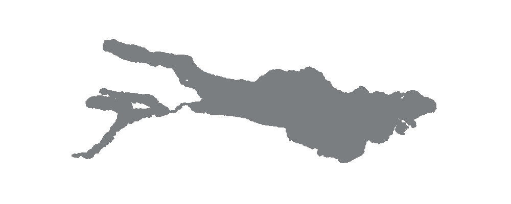
Because the logo at the top left of the website should be rather wide, I then played with extensions that would show the outline of Lake Constance. I experimented with many variations, but I liked the combination of >~^v> the best.
The idea was definitely to capture the outline of Lake Constance. The fact that the result also resembles a fish was a fitting side effect.
Do you recognize Lake Constance? I think so. Here again for comparison.


